Reproducing the WSJ Measles Vaccination Chart Using R
Using ggplot2 and animation packages to reproduce and animate the famous Wall Street Journal Measles Incidence Chart
Mastering Animation in R
UPDATE: In order to reproduce some portions of this code you need
the gganimate package using the deprecated API. To access that
version, download v0.1.1 here.
Recently I’ve been working on creating gif animations for social media:
New from \#COE2017: 21% of students reported being bullied at school in 2015, a ↓ from the 28% reported in 2005. https://t.co/5BlyLdHS9W pic.twitter.com/Fr1pTt8xca
— NCES (@EdNCES)
May 3, 2017
It’s pretty addicting! And not as complicated as it appears. Let’s walk through the creation of a gif using R.
Wall Street Journal Measles Vaccination Chart
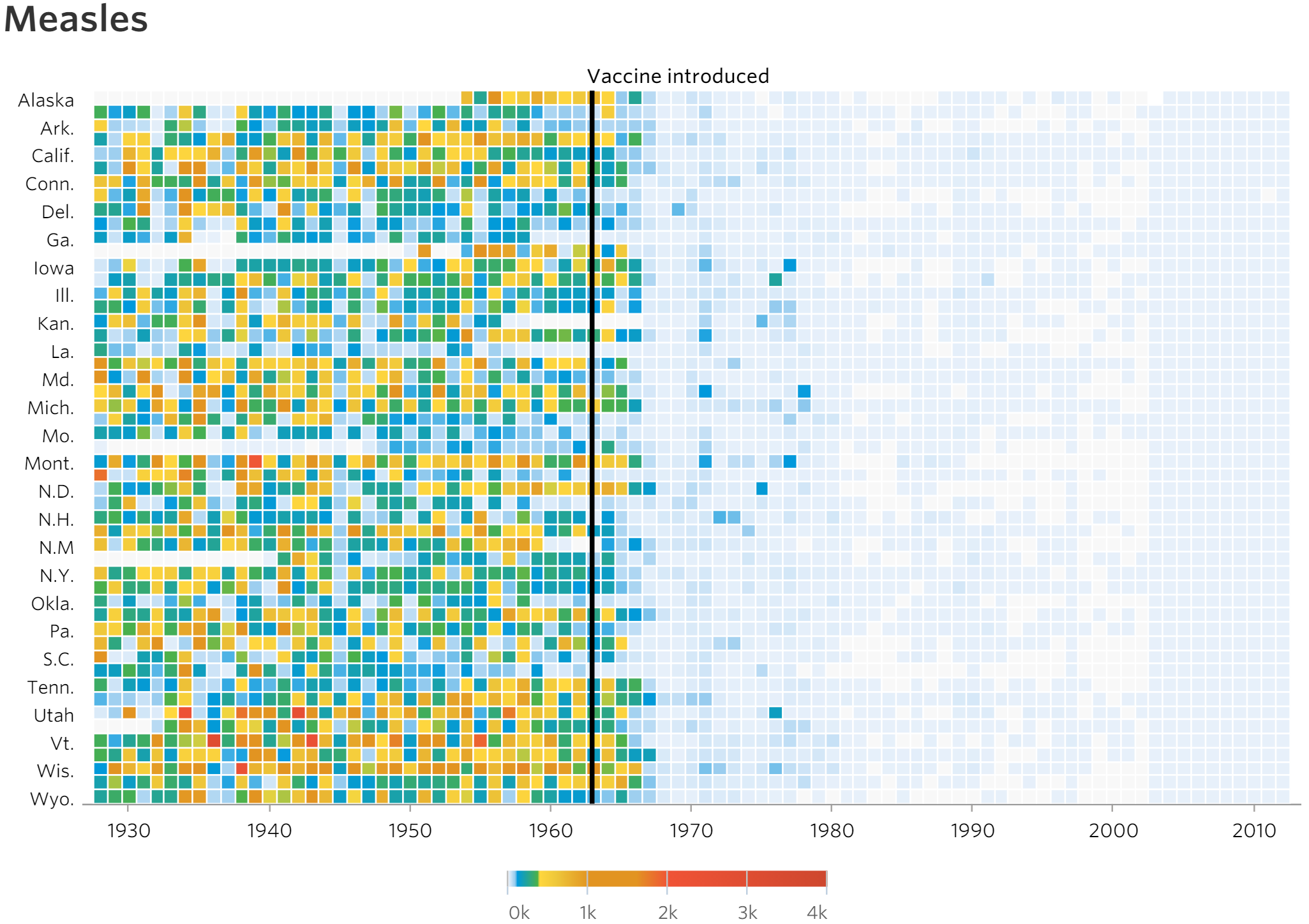
One of the more compelling data visualizations produced in recent years is the following representation of measles incidence from 1928 to 2003 produced by the Wall Street Journal graphics team:

In the two years after its release, many prominent data journalists, designers, and developers have analyzed/applauded the design decisions in the chart, which urge the reader to its take-home message: the introduction of the measles vaccine drastically reduced the incidence of the virus.
Recognizing it’s merit, let’s accentuate that take-home message by adding the element of animation.
Download dependent packages and prep the data
    library(reshape2)
    library(dplyr)
    library(extrafont)
    library(ggplot2)
    library(gganimate)
    library(animation)
    library(grid)
We’ll use reshape2 and dplyr to manipulate the data, ggplot2 to
plot it, gganimate for a first animation exploration, and animation and grid for a customized finished product.
Download and prep the data (everything is a remix)
The heavy data prep and plotting for this plot has been done already! Much of this code comes from this site, with small improvements and the inclusion of some omitted pieces. From that site, I’ve relinked the steps to download the data:
- Register and login to “Project Tycho“
- Go to level 1 data, then Search and retrieve data
- Now change a couple of options: geographic level := state; disease outcome := incidence
- Add all states (highlight all at once with Ctrl+A (or Cmd+A on Macs)
- Hit submit and scroll down to Click here to download results to excel
- Open in excel and export to CSV
Once we’ve got the data and you’ve set your working directory, lets read in the file and reshape it:
    measles <- read.csv("/home/michael/Documents/animation_samples/measles/measles.csv", skip=2)
    measles <- melt(measles, id.var=c("YEAR", "WEEK"))
    colnames(measles) <- c("year", "week", "state", "cases")
    measles$cases <- ifelse(measles$cases=="-",NA,measles$cases)
    measles$cases <- as.numeric(measles$cases)
One piece I wanted to replicate was the state abbreviations used in the figure. I used the AP style guide, and you can access that csv through this link:
    stateAP <- read.csv("/home/michael/Documents/animation_samples/measles/stateName.csv")
    stateAP$stateName <- toupper(stateAP$stateName)
    measles$state <- stateAP$stateAP[match(measles$state,stateAP$stateName)]
Finally, we’ll create our measles data frame by summarizing the incidence of measles occurring in each state by year, while also recoding instances in which state’s have no incidence/values for a given year as NAs.
    mdf <- measles %>% group_by(state, year) %>%
      summarise(incidence=if(all(is.na(cases))) NA else
        sum(cases, na.rm=T))
    mdf$state <- factor(mdf$state, levels=rev(levels(mdf$state)))
Create the figure using ggplot2
We’ll pull the colors directly from the WSJ javascript source
code.
We’ll also load the Open Sans family of fonts via loadfonts()
    cols<- c("#e7f0fa", #lighter than light blue
             "#c9e2f6", #light blue
             "#95cbee", #blue
             "#0099dc", #darker blue
             "#4ab04a", #green
             "#ffd73e", #yellow
             "#eec73a", #mustard
             "#e29421", #dark khaki (?)
             "#f05336", #orange red
             "#ce472e") #red
    extrafont::loadfonts()
Nifty!
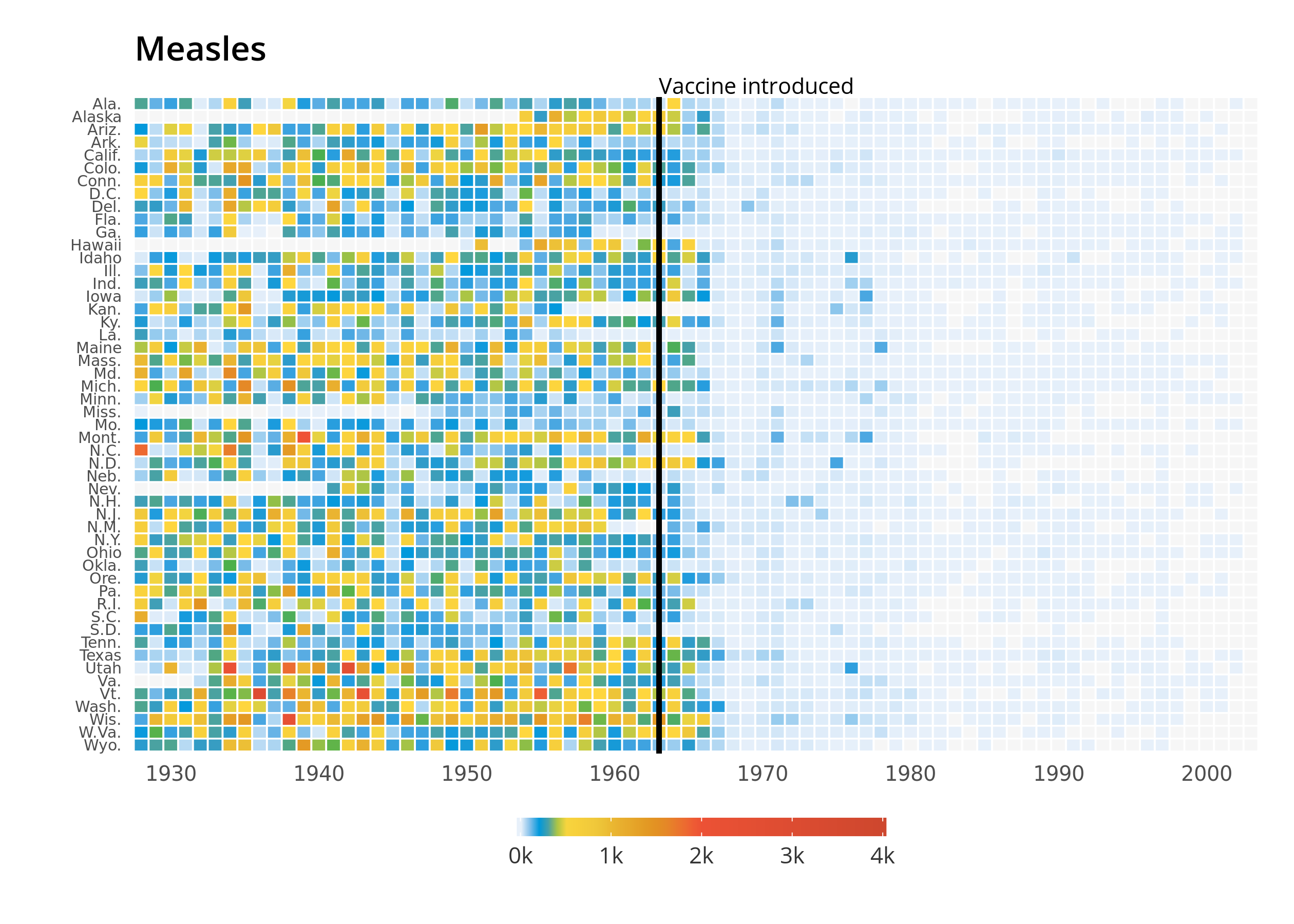
Let’s shift to making the plot. The majority of the figure is generated via these three function calls:
    gg <- ggplot(mdf, aes(y=state, x=year, fill=incidence)) +
      geom_tile(colour="white",
                width=.9, height=.9) + theme_minimal() +
      scale_fill_gradientn(colours=cols, limits=c(0, 4000),
                           values=c(0, 0.01, 0.02, 0.03, 0.09, 0.1, .15, .25, .4, .5, 1),
                           na.value=rgb(246, 246, 246, max=255),
                           labels=c("0k", "1k", "2k", "3k", "4k"),
                           guide=guide_colourbar(ticks=T, nbin=50,
                                                 barheight=.5, label=T,
                                                 barwidth=10))
The most contentious design decision made by the WSJ authors is
undoubtedly the color scale. Aligning gradient color values (in our
chart as values=c(0, 0.01, 0.02, 0.03, 0.09, 0.1, .15, .25, .4, .5, 1)) so that
one portion of the scale is weighted more prominently than the other
accentuates the message of the chart; some might see this as ambiguous
or misleading - it’s challenging to ascribe what value a given color
stands for. Once we have the skeleton for our plot, we can add an
appropriate x axis scale, vaccine introduction line, and figure labels:
    gg <- gg +
      scale_x_continuous(expand=c(0,0),
                         breaks=seq(1930, 2010, by=10)) +
      geom_segment(x=1963, xend=1963, y=0, yend=51.5, size=.9) +
      labs(x="", y="", fill="") +
      ggtitle("Measles")
Finally, we’ll add in our theme.
    gg <- gg +
      theme(legend.position=c(.5, -.13),
            legend.direction="horizontal",
            legend.text=element_text(colour="grey20"),
            plot.margin=grid::unit(c(.5,.5,1.5,.5), "cm"),
            axis.text.y=element_text(size=6, family="Open Sans Regular",
                                     hjust=1),
            axis.text.x=element_text(size=8, family="Open Sans Regular"),
            axis.ticks.y=element_blank(),
            panel.grid=element_blank(),
            title=element_text(hjust=-.07, vjust=1,
                               family="Open Sans Semibold"),
            text=element_text(family="Open Sans")) +
      annotate("text", label="Vaccine introduced", x=1963, y=53,
               vjust=1, hjust=0, size=I(3), family="Open Sans")
Voila!

Explore the ggplot2 object with gganimate
It’s dang easy to create an animation using gganimate. Just add frame to the initial ggplot2 call and you’re good to go! In our plot,
we’ll want to iterate over the data years, so .frame = year
gganimate(gg, “/home/michael/Documents/mikeleeco.github.com/static/img/gganimate_measles.gif”)

That’s a great start! Though this could be further developed using gganimate I prefer to use the animation package’s saveGIF function
since I prefer the method in which multiple images can be called within
one call.
Refine our gif using animation
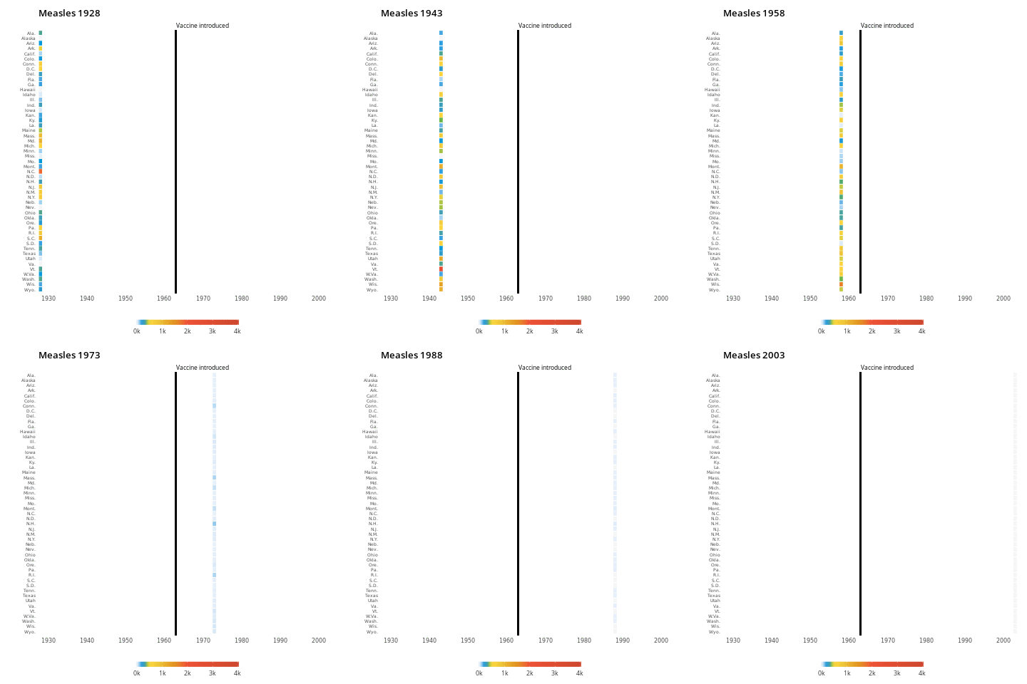
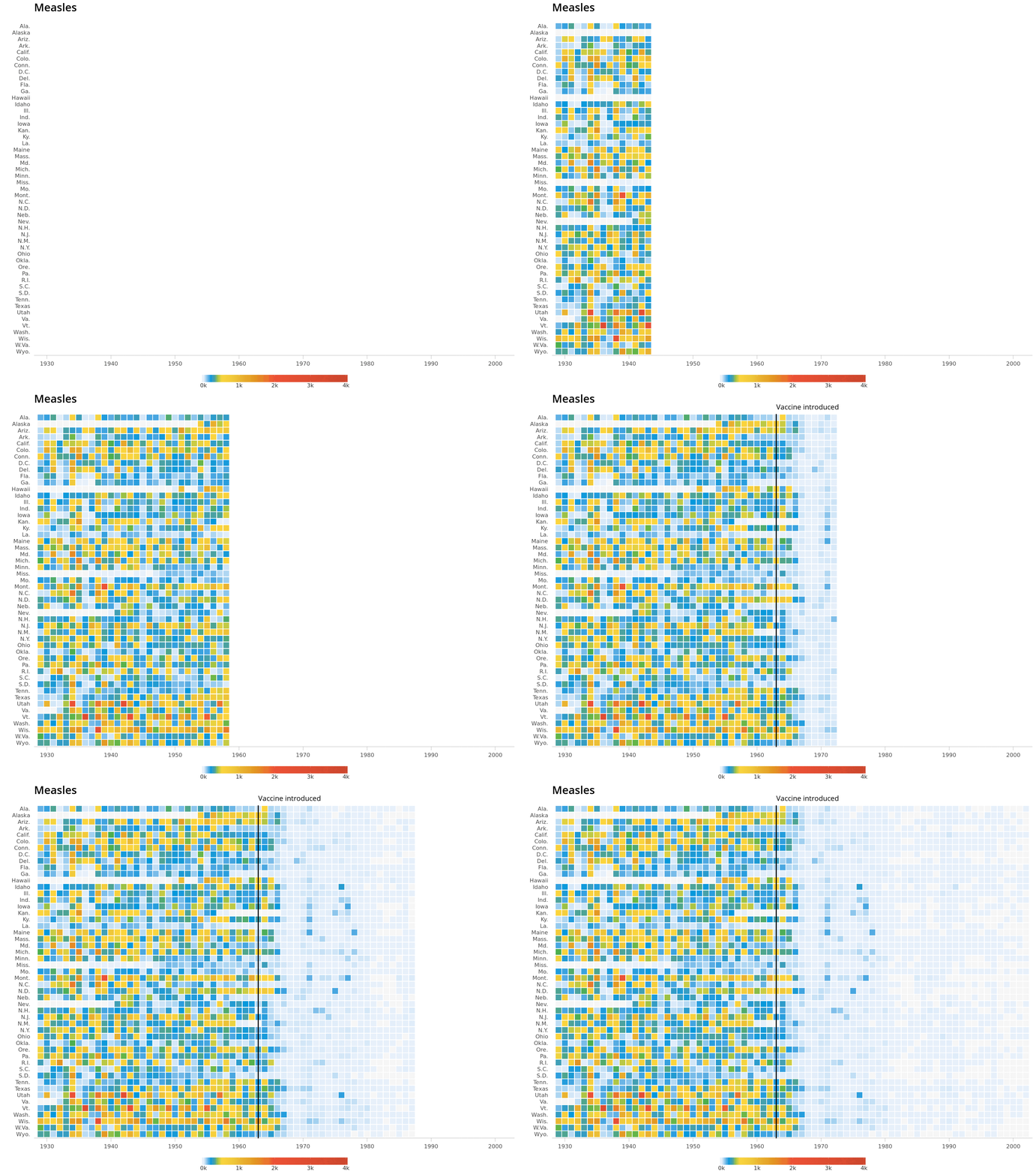
The main idea behind creating our animation will be iteratively printing
images of larger subsets of our data set. In the for-loop, subset(mdf, year<=1928+i-1) takes the i-th value to subset the data
year used in the figure. For example, for i==5, the data years 1928
through 1932 will appear in that image.
Besides this change, and the addition of frame=year, our ggplot2 call
is nearly the same (I bumped up the font sizes to correspond with a
larger image size). One supplement to the chart is the addition of
pauses at critical points in the figure: in 1963 (when the measles
vaccine was introduced) and in 2003 (the final data year of the figure).
We’ll use if statements to determine whether pieces of the plot should
be “drawn” given the circumstances of the subset. Here’s our final code:
    saveGIF(
      for (i in 1:76) {

        gg <- ggplot(subset(mdf, year<=1928+i-1), aes(y=state, x=year, fill=incidence, frame=year)) +
          geom_tile(colour="white",
                    width=.9, height=.9) + theme_minimal() +
          scale_fill_gradientn(colours=cols, limits=c(0, 4000),
                               values=c(0,0.01, 0.02, 0.03, 0.09, 0.1, .15, .25, .4, .5,1),
                               na.value=rgb(246, 246, 246, max=255),
                               labels=c("0k", "1k", "2k", "3k", "4k"),
                               guide=guide_colourbar(ticks=T, nbin=50,
                                                     barheight=2, label=T,
                                                     barwidth=40)) +
          scale_x_continuous(expand=c(0,0),
                             breaks=seq(1930, 2010, by=10), limits = c(1928,2003))

            # add in vertical line for data year >= 1963 (when the vaccine was introduced)
          if(max(subset(mdf, year<=1928+i-1)$year) >= 1963) {

         gg <- gg + geom_segment(x=1963, xend=1963, y=0, yend=51.5, size=1.5) +
              annotate("text", label="Vaccine introduced", x=1963, y=53,
                       vjust=1, hjust=0, size=I(10), family="Open Sans")
          } else {
            # doesn't add vertical lineif before 1963! instead annotate with text ""
            gg <- gg +
              annotate("text", label="", x=1963, y=53,
                       vjust=1, hjust=0, size=I(10), family="Open Sans")
          }
        gg <- gg + labs(x="", y="", fill="") +
          ggtitle("Measles") +
          theme(legend.position=c(.5, -.075),
                legend.direction="horizontal",
                legend.text=element_text(colour="grey20", size = 22, family="Open Sans Regular"),
                plot.margin=grid::unit(c(.5,.5,2.5,.5), "cm"),
                axis.text.y=element_text(size=22, family="Open Sans Regular",
                                         hjust=1),
                axis.text.x=element_text(size=22,family="Open Sans Regular",margin=margin(10,0,0,0,"pt")),
                axis.ticks.y=element_blank(),
                axis.line.x=element_line(colour = "grey50"),
                axis.ticks.length=unit(.5, "cm"),
                axis.ticks.x=element_line(colour = "grey50"),
                panel.grid=element_blank(),
                title=element_text(hjust=-.07, vjust=1, size = 36,
                                   family="Open Sans Semibold"),
                text=element_text(family="Open Sans"))

        # adding in pauses for data year == 1963 (when the vaccine was introduced) and 2003 (the last year in our data)
        # the replicate() function will take a ggplot2 object and print it n-times via grid.draw()
        if(max(subset(mdf, year<=1928+i-1)$year) == 1963) {
          replicate(30,grid.draw(gg))
        } else if (max(subset(mdf, year<=1928+i-1)$year) == 2003) {
            replicate(30,grid.draw(gg))
      } else {
      print(gg)
    }
      }
      ,movie.name="/home/michael/Documents/mikeleeco.github.com/static/img/measles.gif",interval = .1, ani.width = 2050, ani.height = 1550)
Addendum - Gif File Size Management:
Customized gifs can get super large. The version above tops of at 73.4
MB! We’ll need to reduce that size for . One source for an #rstats
solution is this
site - which
uses the open source tool gifsicle to reduce gif file sizes. Let’s port this author’s gif_compress script
to minimize our measles gif:
    gif_compress <- function(ingif, outgif, show=TRUE, extra.opts=""){
      command <-  sprintf("gifsicle -O3 %s < %s > %s", extra.opts, ingif, outgif)
      system.fun <- if (.Platform$OS.type == "windows") shell else system
      if(show) message("Executing: ", strwrap(command, exdent = 2, prefix = "\n"))
      system.fun(ifelse(.Platform$OS.type == "windows", sprintf(""%s"", shQuote(command)), command))
    }
    gif_compress("/home/michael/Documents/mikeleeco.github.com/static/img/measles.gif","/home/michael/Documents/mikeleeco.github.com/static/img/measlesCompressed.gif",extra.opts="--colors 256")

    ## Executing:
    ## gifsicle -O3 --colors 256 <
    ##   /home/michael/Documents/mikeleeco.github.com/static/img/measles.gif >
    ##   /home/michael/Documents/mikeleeco.github.com/static/img/measlesCompressed.gif

    file.size("/home/michael/Documents/mikeleeco.github.com/static/img/measles.gif")

    ## [1] NA

    file.size("/home/michael/Documents/mikeleeco.github.com/static/img/measlesCompressed.gif")

    ## [1] NA
Still large but more manageable.